What Is a Dashboard?
Dashboards track KPIs, metrics, and other data points in one visual, central place. They give you a high-level view of work, helping you make quick decisions and keeping everyone up to date. A dashboard’s visual nature simplifies complex data and provides an at-a-glance view of current status or performance in real time.
Dashboards are made up of tables, charts, gauges, and numbers. They can be used in any industry, for almost any purpose. For example, you could make a project dashboard, financial dashboard, marketing dashboard, and more.
Tired of static spreadsheets? We were, too.
Although Microsoft Excel is familiar, you were never meant to manage work with it. See how Excel and Smartsheet compare across five factors: work management, collaboration, visibility, accessibility, and integrations.
Before Building the Dashboard: Research, Questions, & Things to Consider
Before you start building your dashboard, first take some time to reflect on why you need a dashboard, what purpose it will serve, where the data will come from, and what you capabilities you do and don’t need.
It might also be helpful to mockup your Excel dashboard on a piece of paper. Draw boxes for each data type to get a sense of the layout and add quick sketches of the type of graphs you want to include. This mockup will help get everyone on the same page and let you get approval from stakeholders before you start spending time and money on the actual dashboard.
Questions to Ask Yourself
- Why are you creating this dashboard? Are you trying to prove or disprove a hypothesis? Is this dashboard for a specific task, like showing status of a project, or does it need to achieve a broader goal, like measuring business performance? Understanding why you are building the dashboard will help guide the design and data.
- Do you need to track certain KPIs? Your dashboard should only highlight data that adds value. Make sure you understand the most important KPIs and create the dashboard around those metrics. Anything outside those main KPIs aren’t necessary.
- Who needs to see the dashboard? Is this for a colleague, manager, stakeholder, external vendor, or C-level executive? How do these people prefer to digest information? How much time do they have to look at this dashboard? Think about who you’re making the dashboard for and keep their preferences in mind.
- Where will the data come from? Do you need to manually import data into your dashboard or will you use an integration or connector to automatically sync and refresh data? What other tools do you use to gather data?
- How up to date does the dashboard need to be? Can you update your dashboard weekly or monthly, or does it always need to show real-time, updated information? Depending on what you chose, this will change the way you build your dashboard.
- What format does the dashboard need to be in? Are you emailing a static dashboard or providing a link to a dynamic one? Does the dashboard need to be embedded in presentations or decks? Do you want to share read-only access or do you want to provide editing capabilities to certain people?
Things to Consider: How to Design the Dashboard
- Dashboard elements: What do you want to include on your dashboard? You can choose from static tables, pivot tables, dynamic charts, Excel gauge widgets, or non-charting objects, like auto-shape objects. Do you want to add a lot of small charts or a couple big charts? Identifying the elements you want to add to your dashboard will help you group similar data together and give you an idea of the layout.
- Dashboard background color: How much color do you want to incorporate in your dashboard? Do you want to add a dashboard background color to make the dashboard elements pop? Do you want to color-code similar charts?
- Enhancing the dashboard UI: How important is ease of use? Do you want to spend time enhancing the dashboard UI? You could add hierarchy to the layout for easy navigation, add drop-down lists, add labels to each graph with auto-shape objects, or use freeze panes to prevent users from scrolling.
Using PowerPoint and Excel
You could also make an interactive dashboard with PowerPoint. Adding interactivity to a pure Excel dashboard can be challenging, and usually requires Macros (or VBAs), the programming language used within Excel. However, if you add the charts and dashboard components you create in Excel to PowerPoint, you can easily add an interactive element.
For example, you could create five pie charts showing the exact same data over the course of five years. If you add one pie chart to each PowerPoint slide, you can move through these slides and the chart will look like it’s in motion.
Using PowerPoint and Excel together also makes it easy to share your dashboard. You can simply save the dashboard as PowerPoint Show and email it to colleagues.
Free Project Dashboard Template in Excel
Download Project Dashboard Template
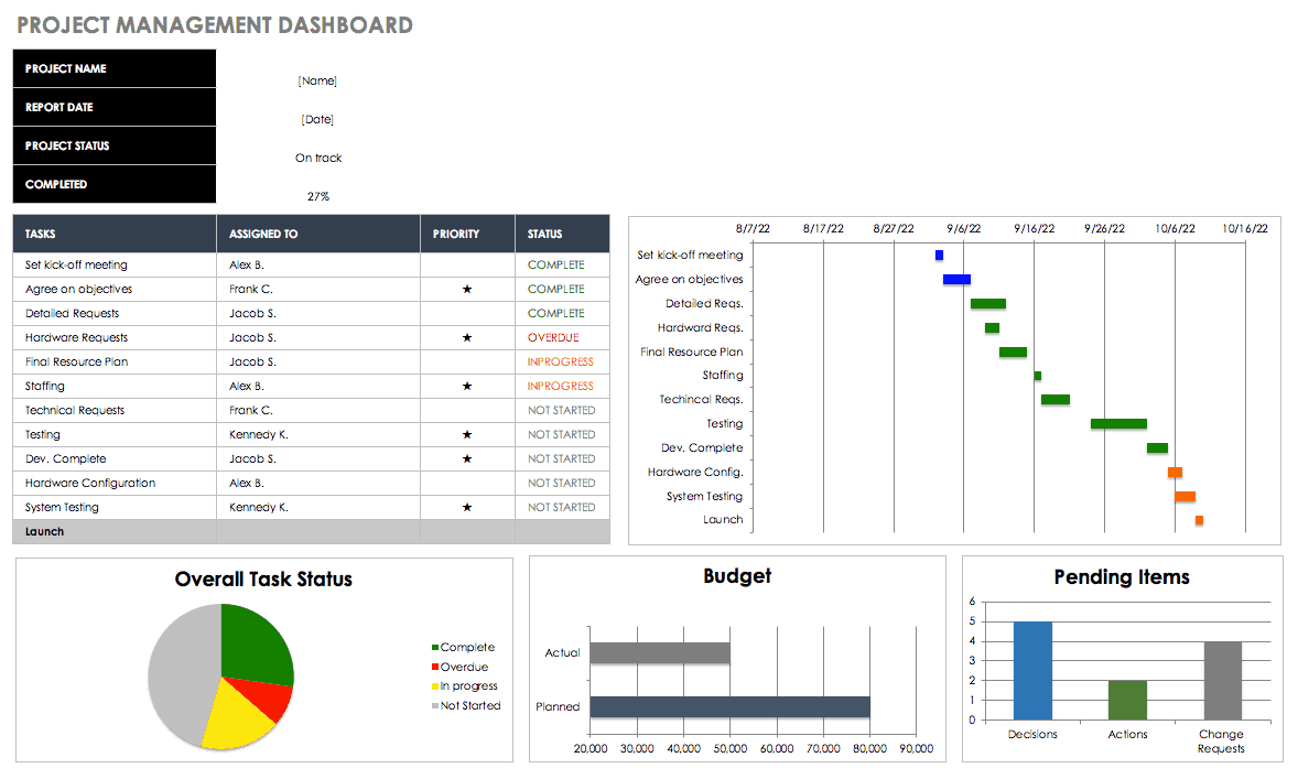
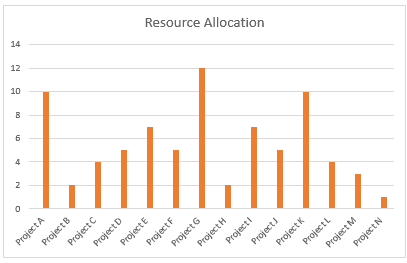
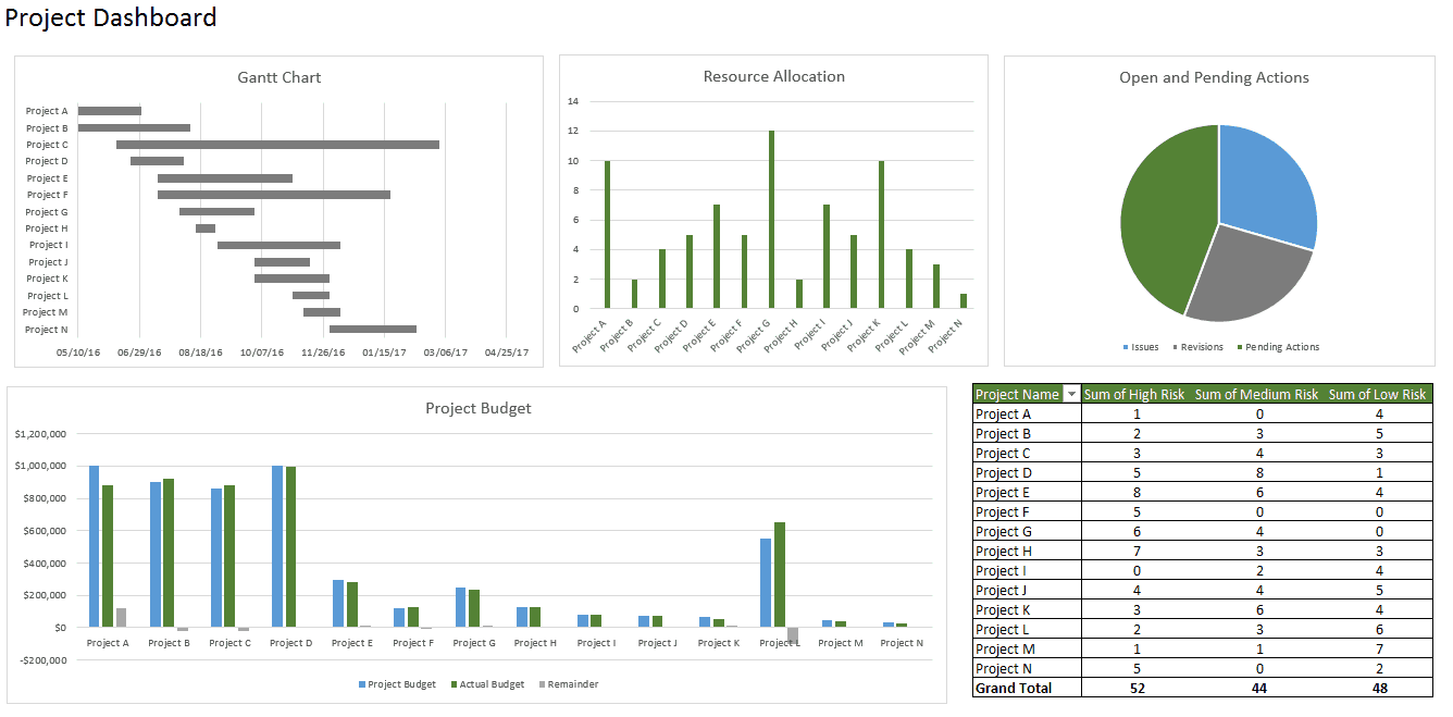
Download a free project management dashboard template in Excel. This template includes a Gantt chart and three other charts to visualize resource allocation, open and pending actions, and project budget. There is also a pivot table showing the level of at-risk tasks for each project.
There are two tabs in the template; one tab for the dashboard and one tab for the raw data. In the Raw Data sheet, you can add your own project information and the charts will automatically update.
Note: When you add your own dates to the table, the Gantt chart will add a lot of white space to the beginning of the chart and will still show dates much earlier than the ones in your table. You can fix this by clicking on a date at the top of your Gantt chart and click on the box that appears around the dates. Right-click and select Format Axis. In the pop-up box, select Scale. Adjust the number in the box labeled Minimum. You’ll have to input numbers incrementally to adjust the spacing and get it to look the way you want.
How to Make a Dashboard in Excel
Here’s a step-by-step Excel dashboard tutorial:
1. How to Bring Data into Excel
Before creating dashboards in Excel, you need to import the data into Excel. You can copy and paste the data, or if you use CommCare, you can create an Excel Connection to your export. But, the best way is to use ODBC (or Live Data Connector). ODBC can connect your apps to Excel, passing real-time data from your app to Excel. As data is updated in your app, your Excel dashboard will also be updated to reflect the latest information. This is a perfect option if you track and store data in another place, and prefer creating a dashboard in Excel. Data can be imported two different ways: in a flat file or a pivot table.
2. Set Up Your Excel Dashboard File
Once you have added your data, you need to structure your workbook. Open a new Excel Workbook and create two to three sheets (two to three tabs). You could have one sheet for your dashboard and one sheet for the raw data (so you can hide the raw data). This will keep your Excel workbook organized. In this example, we’ll have two tabs.
3. Create a Table with Raw Data
- In the Raw Data sheet, import or copy and paste your data. Make sure the information is in a tabular format. This means that each item or data point lives in one cell.
- In this example, we’re adding columns for Project Name, Timeline, Number of Team Members, Budget, Risks, Open Tasks, and Pending Actions.
- If needed, you can use a formula to automatically add all the values in a column. We will do this for our Budget, Risks, Open, and Pending Actions columns. Click on an empty cell at the bottom of the column, and type =SUM(. After the open parenthesis, click the first cell in the column and drag your mouse down to the last cell. Then, add a close parenthesis to your formula. Repeat as necessary.
4. Analyze the Data
Before building the dashboard, take some time to look at your data and figure out what you want to highlight. Do you need to display all the information? What kind of story are you trying to communicate? Do you need to add or remove any data?
Once you have an idea of your dashboard’s purpose, think about the different tools you can use. Options include:
- Excel formulas like SUMIF, OFFSET, COUNT, VLOOKUP, GETPIVOTDATA and others
- Pivot tables
- Excel tables
- Data validation
- Auto-shapes
- Named ranges
- Conditional formatting
- Charts
- Excel dashboard widgets
- Macros
Don’t worry, you don’t need to know how to use every single one of these Excel tools. With some basic knowledge of charts and pivot tables, you can make a beautiful Excel dashboard.
5. Build the Dashboard
Add a Gantt Chart
We’ll add a Gantt chart to visually show your project timeline.
- Go to your Dashboard sheet and click Insert.
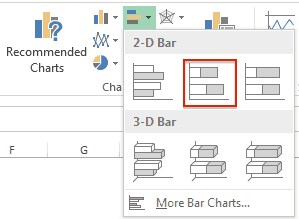
- In the Charts section, click the bar chart icon and select the second option.
- You’ll now have to link this bar chart to the Project Name, Start Date, and Duration columns in your Raw Data sheet.
- For complete step-by-step instructions on how to create a Gantt chart in Excel, click here.
Create and Format Charts
- In your Dashboard sheet, click Insert and select the kind of chart you’d like to make. For this first example, we’ll create a column chart.
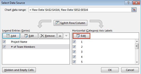
- Right-click on the chart and click Select Data.
- Click Add in Legend Entries (Series).
- In the Series name field, click the title of the column you want to add on the Raw Data sheet. Hit enter.
- In the Series values field, select all the data in that corresponding column. Hit enter and then click Ok.
- You’ll notice that your X-axis is not correctly labeled. To fix this, click Edit in the Horizontal (Category) Axis Labels and in the Raw Data Sheet, select what you’d like to display on the X-axis.
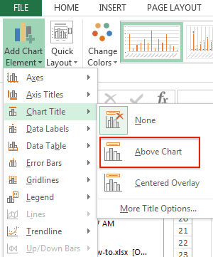
- To add a title to your chart, select your chart and click the Design tab.
- Click Add Chart Element > Chart Title > Above Chart.
- Type your title in the text field on the chart.
- Repeat this process for any other charts you want to create.
Insert PivotTables
A pivot table allows you to extract and highlight the most important information from a large data set.
Here’s how to insert a pivot table:
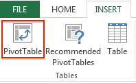
- Go to your Dashboard sheet and on the Insert tab, click the PivotTable button.
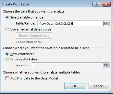
- A pop-up box will appear. In the Table/Range field, click the icon at the end and and select your whole data table from your Raw Data sheet. Click Ok.
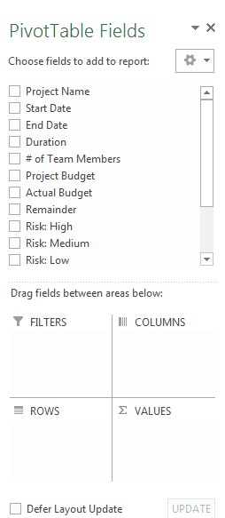
- The PivotTable Field List will appear on the right side of your screen. Select which subsets of data you would like to include in your pivot table by clicking the boxes.
- If you’d like to include another pivot table in your dashboard, repeat steps 1-3.
6. Customize with Macros, Color, and More
Now that you have the elements of your dashboard in place, it’s time to customize the layout, colors, and typography, and add animation if you feel comfortable.
Customize Chart Colors and Font
- Click on the section(s) of the chart where you’d like to change the color.
- In the Home tab, in the Font group, click the paint bucket icon and select the color you’d like to add.
- If you want to add a background color to a chart, right-click on the chart and select Format Chart. Under Fill, click Solid Fill and choose the background color from the paint bucket icon in the Font group.
- If you want to change your chart titles, click on a chart title and in the Font group, you can select your font type, size, and color.
- To add a title to your dashboard, put your cursor in the upper-right cell (A1) right-click, and select Insert > Entire Row. Do this a couple times until you have space to add a title. Then, select a couple cells in the first empty row and in the Alignment group, click Merge and Center. You now have space to add your dashboard title.
Create a Dynamic Chart
If you want to add interactivity to your dashboard, you have a couple different options.
- Drop-down list/data validation list: If you have an advanced knowledge of Excel and understand VLOOKUP and formulas, you can use a drop-down list (also known as a data validation list) to create interactive charts. With this drop-down list, viewers can select the criteria they want to filter on and the chart will automatically change to reflect that criteria. For more information on creating a data validation list with VLOOKUP, click here.
- Macros: You can write a Macro using Excel’s coding language (called Visual Basic) to automate a task. For example, instead of manually sifting through a lot of data and moving data to different sheets, a Macro can automate the process for you. You can also use Macros to create a button on your dashboard. When you click that button and select a certain criteria, all the charts will automatically change to represent that specific criteria.
- Slicers: If you want to add another layer of filtering to your pivot table, you can use slicers. Slicers are visual filters and with just one click, you can filter the pivot table report (a report filter requires several clicks to filter). Slicers contain a set of buttons that let you filter the data and also show you which filter you are viewing. You can use these slicers to create an interactive chart. Set up a pivot table and add a slicer for a certain filter/criteria. Create a chart from the pivot table and move the slicer next to the chart. Now, when you select different buttons on your slicer, your chart will change dynamically.
For a comprehensive list of the best dashboard templates, visit Sample Dashboard Templates Roundup.
How to Make a Dashboard in Smartsheet
Smartsheet is an enterprise work management platform that fundamentally changes the way teams, leaders, and businesses get work done. Over 74,000 brands and millions of information workers trust Smartsheet as the best way to plan, track, automate, and report on work.
Making good business decisions requires having the right information available at the right time. With dashboards in Smartsheet, you’ll have real-time visibility into work progress to make better decisions and keep your teams on the same page every step of the way.
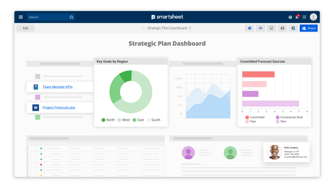
The configurable, widget-driven dashboards enable users to highlight the information that’s most relevant to their business - without the need for technical support. Know the status of your business at a glance, gain insights, and accelerate your team’s innovation all in one platform.
Before you start building a dashboard, there are three factors you must determine.
1. Your purpose: Is this dashboard for a single project, multiple projects, or a general information hub?
2. Your audience: Are you building a dashboard for yourself, your team, middle management, or a C-level executive?
3. Your data: What data and information will be most useful for your audience?
Learn how to get started with Smartsheet dashboards.
Dashboard Dos and Don'ts
Here are some general dashboard advice and tips:
- Keep it simple, stupid (KISS): A simple, easy-to-understand dashboard is much more effective than a “pretty” dashboard. Avoid the temptation to add 3D effects, gradients, extra shapes, and other bells and whistles. Instead, use magazine formatting. Look at the charts and tables from business magazines and adopt their simplicity and readability.
- Use freeze panes: You can use freeze panes to make your dashboard more easily navigable. You can freeze all your rows so that viewers can see your whole dashboard in one view, without scrolling. You can also freeze headings in the top rows so that the headings are visible, even when you scroll down the dashboard.
- Add alerts for important information: If you want to highlight a certain aspect of your dashboard or quickly convey status, add alerts (or red, yellow, green balls). You can use these traffic light symbols with conditional formatting, so they automatically update based on the values in your table.
- Use shapes and charts together: The layout of your dashboard can get repetitive if you have multiple charts all in the same box layout. You can add visual interest and hierarchy to your dashboard by inserting a shape (like a rectangle, circle, etc) and then putting your chart on top of that shape.
- Use different tabs: Keep your dashboard organized by using different sheets for different things. For example, one tab will hold the dashboard itself and another tab will hold the raw data that populates the dashboard.
What Not to Do with Excel Charts and Dashboards
- Bold, bright colors: Don’t add a rainbow-themed color palette to your dashboard in hopes of making it look more “fun.” These bright colors distract from the important information. Instead, use muted colors and only add stronger colors to highlight key items.
- Crowded layout: Don’t include every possible data set or chart to your dashboard. Too much data will overwhelm the viewer and end up hiding the really important information. If you end up with a crowded dashboard, take a step back and reevaluate if everything is necessary. All the data should support the single purpose of your dashboard.
- Lack of focus: A crowded layout and lack of focus usually go hand-in-hand. Make sure all your charts are supporting the same purpose or hypothesis and cut out all the extras. The data should tell the same story.
Common Questions About Dashboards
Q: Should you use Excel gauges/speedometer charts?
A gauge chart (or speedometer chart) combines the doughnut chart and pie chart into one, resembling the speedometer in a car. However, they tend to be too simple and they can lack context. And, they’re not good at visualizing the status of one metric. Instead of a gauge chart, try a bullet chart (or thermometer chart). A bullet chart shows all the same information, but with more context. Bullet charts are an easy-to-digest, linear chart that shows a lot of data in a small space.
Q: How do you select the right chart based on your data?
Identify the purpose of the chart. When you understand why you need to create a chart, you’ll be able to select the best chart type for that reason. Be sure to focus on only one message; if you try to convey too many things in one chart, it’ll become hard to read.
If you want to compare things, you may choose a bar chart, pie chart, line chart, or scatter plot. If you want to show distribution, you may go with a column chart, scatter plot or line chart. If you want to show trends over time, a line chart is a great option. Or, if you want to represent parts of a whole, a pie chart would work well.
Q: Should you use pie charts?
Many visualization experts hate pie charts. When comparing multiple factors, the data isn’t immediately understandable nor digestible. There may be ten data points on the pie chart and while you may be able to identify the biggest chunk of the pie, it’s hard to understand how all the other data points relate. We’re just not good at comparing slices of a circle. On the other hand, with a bar chart, we compare the endpoints. They’re all aligned at a common baseline and it’s easy to understand the relative size. You can see which segment is larger and how much larger than other segments.
This doesn’t mean you should avoid pie charts 100% of the time. However, you should be aware that it’s very easy to default to the pie chart. Try and only use a pie chart when you’re comparing two to three different data points with very different amounts of information.
Q: How do you show budget vs actual performance?
There are a number of different ways to show budget vs actual performance with charts. You could use a bullet chart, an area chart, a line chart, a column chart with markers, RYG (red, yellow, green) balls in a table, or pie charts in a table.
Q: How do you publish Excel dashboards to the web or send your dashboard to others?
You can save an Excel dashboard to a static web page, save the Excel sheet as a PDF and upload it to your company Intranet, or add the file to Dropbox or another cloud storage tool and share the link.
If you don’t need the Excel dashboard to live on the web, you can send it via email.
Different Kinds of Dashboard Templates
You can create a dashboard for almost anything. Here are some examples of the most common kinds of dashboards in organizations today:
- Web analytics dashboard: Track your website’s performance in real time with a web analytics dashboard. You can include metrics like visitors, bounce rate, average time on site, or average page views. You can also add referral traffic data (social, organic, search, referral, or paid).
- Sales tracking dashboard: Get the big picture view of all sales activities and progress. You can track sales pipeline activity, key metrics, status, and add charts like a sales forecast chart. Once you have all sales metrics in one place, you can then analyze by pipeline stage or sales rep to identify potential gaps early on.
- HR analytics dashboard: Consolidate all HR activities, projects, and timelines into one view with a dashboard. You can check status on hiring and onboarding, employee programs, and department spend.
- SEO analytics dashboard: Track keywords, organic visits, paid search terms, internal searches, revenue, and more with an SEO analytics dashboard. Most of this data (if not all) will come from Google Analytics, so look for a dashboard solution that can bring in real-time metrics from Google Analytics.
- Product metrics dashboard: Use a product dashboard to track and report on product metrics like development status, revenue, time to market, win/loss analysis, and more. You could also create a public dashboard of your product roadmap and publish it to your website.
- BI dashboard: A business intelligence (BI) dashboard visualizes the KPIs for an enterprise. BI dashboards can track things like gross bookings, gross loss, target vs actuals, new customers, customer cancellations, and more.
- Social media dashboard: A social media dashboard gives you a quick look at all your social channels in one place. You can track followers/fans on Twitter, Facebook, and LinkedIn, engagement on all the channels, referral traffic from social media, and how many times your content is shared.
