Article
Smartsheet dashboard design: On-brand custom themes

In our previous blog posts on Smartsheet dashboard design, we explored the importance of effective layouts, strategic color use, and even some secret design tools to help you craft engaging dashboards.
Building on those fundamentals, this post dives into the world of custom color themes.
Creating a theme that aligns with your brand ensures consistency throughout your brand’s ecosystem. It can make your dashboard more engaging and readable, truly elevating the effectiveness of your dashboards.
As a designer on the User Experience team, the following is how I would go about creating my own custom color theme.
Choosing your theme
The first step is deciding between a light or a dark theme. Light themes, often associated with warmth and energy, tend to use colors like reds, yellows, and oranges. Dark themes, on the other hand, can be more striking and suitable for data-heavy dashboards, often employing cool colors like blues, purples, and teals. If your brand colors align more naturally with light or dark theming you may want to take that into consideration. Though, feel free to explore! 🙂
Building your palette
To keep things simple, we’ll take a balanced approach and create a neutral color theme. We recommend using Coolors.co, a free online tool that makes it easy to explore and build a color palette.
A step-by-step guide for creating an on-brand custom theme
Start with your logo to create a palette based on your brand
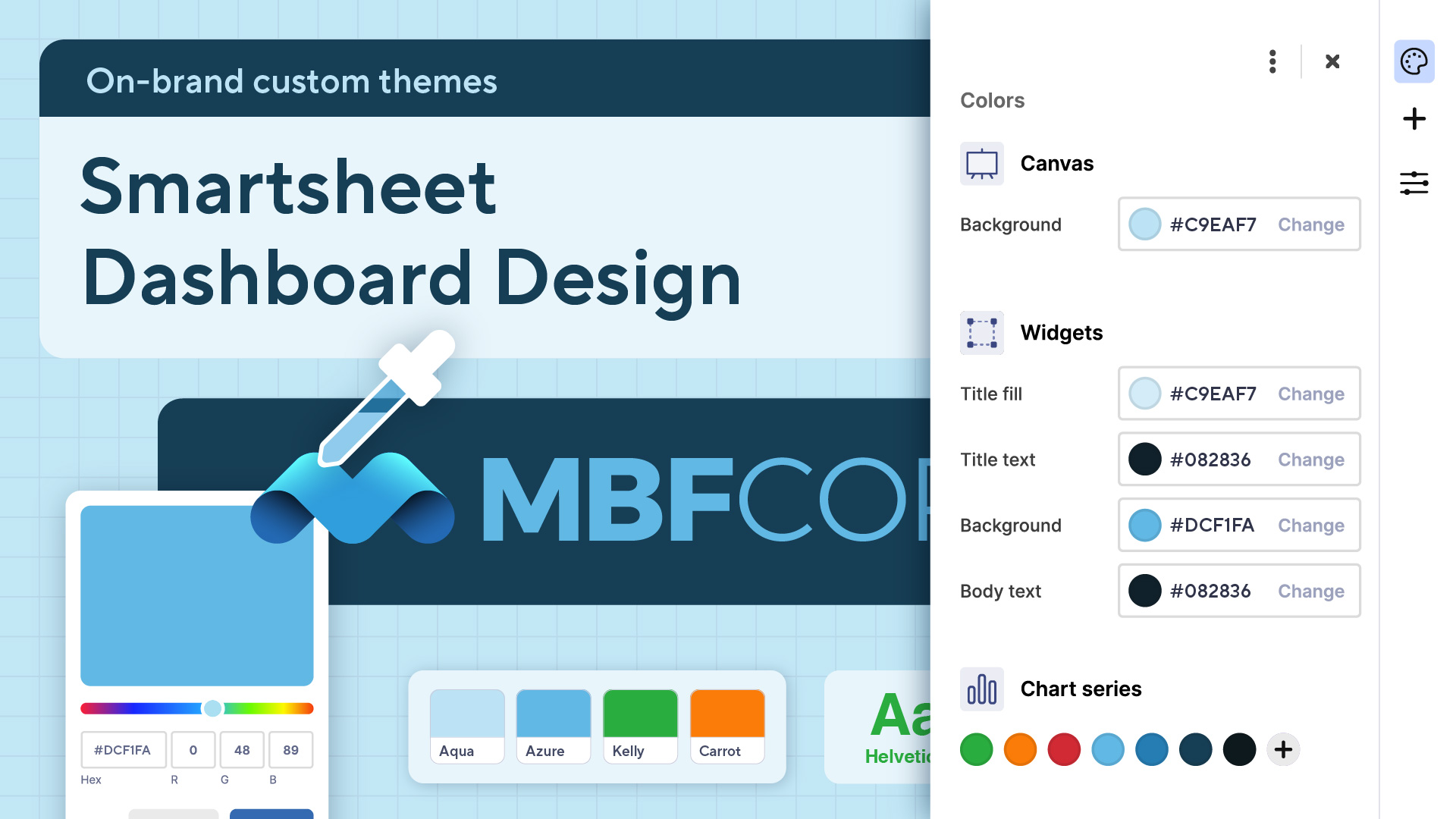
Select your base color:
First, visit Coolors.co and click the ‘start the generator’ button. Next, you’ll click the hex code on the first color in the palette and click on the eyedropper tool.
Now you’ll use the eyedropper tool to select a dominant color from your branding or a color that you want to set as the foundation of your theme.
Once you’ve selected a color, click the sun icon and adjust the brightness to +75.
Set your base color:
Now lock this color on your Coolors palette and go to your Smartsheet dashboard to create a new custom theme. Apply this color as the background of your dashboard canvas and the background of your title widget.
Choose a widget color:
Next, you’ll copy and paste your base color to the next swatch on the right.
Click the grid icon to view the color shades and select a slightly lighter shade.
After that, go to your Smartsheet dashboard and apply the widget color to the widget title fill and widget background.
Choose text colors:
Copy and paste the widget title color to the next swatch on the right.
Again, you’ll click the grid icon, but this time choose a dark shade toward the bottom of the spectrum.
Now go to your Smartsheet dashboard and apply the text color you chose to all of the text elements in your theme.
Choose semantic chart colors:
Make sure your base color is still locked in Coolors.
Use the spacebar to generate semantic colors, such as green, yellow, and red, for your charts. Once you find a green, yellow and red color that pairs with your base color, lock it until you have one color for each.
Once you’ve selected semantic chart colors go back to Smartsheet and apply your semantic colors to your custom themes chart series palette.
Choose additional chart colors:
Copy and paste your base color into the remaining swatches.
Use the grid icon on each remaining swatch to select darker and darker shades for each swatch.
Once you’ve selected additional chart colors go back to Smartsheet and apply those chart colors to your custom themes chart series palette.
Adjust and refine how you use the colors in your palette:
Once you’ve added all of your palette colors to your custom theme, refine and tweak where your chart colors are used to make your dashboard pop.
Dashboards that speak your brand
In essence, crafting a custom theme for your Smartsheet dashboards is about more than just aesthetics; it's about creating a cohesive, impactful narrative with your data. By meticulously selecting and applying colors that resonate with your brand and enhance readability, you transform your dashboards from simple data displays into powerful communication tools.
This step-by-step guide empowers you to build palettes that not only look professional but also optimize data comprehension. Remember, the goal is to guide your viewer's eye and highlight key insights that drive informed decision-making, and ultimately, better business outcomes. So experiment, refine, and make your dashboards the ultimate brand ambassadors!

