Article
6 AI-generated chart ideas to instantly add to your Smartsheet dashboards

Every project leader has to measure, track, and report on their projects — but not every project leader is a data analyst. Manually creating even simple charts, adding them to dashboards, and keeping them up to date can be seriously time consuming.
That’s why Smartsheet released analyze data, an AI tool that empowers everyone to generate beautiful and dynamic charts and add them to new or existing dashboards in seconds. Open the analyze data panel and you’ll see suggested prompts to help you get started based on the data in your sheet. Select one of the suggested prompts or simply type your question or desired output using natural language, and you’ll get instant, shareable insight into your sheet data that updates in real-time as your projects progress.
To bring this exciting tool to life, we’re sharing six examples of AI-generated charts to add to your Smartsheet dashboards today. Keep scrolling and start analyzing!
1. Tasks by status
The Scenario
You need an at-a-glance view of how many tasks are currently in flight and where they are in your team’s workflow. This ensures work continuously moves forward and isn’t getting stuck in any particular process step.
The Prompt
Create a pie chart showing how many tasks are in each workflow status. Don’t include upcoming or completed tasks.
The Chart
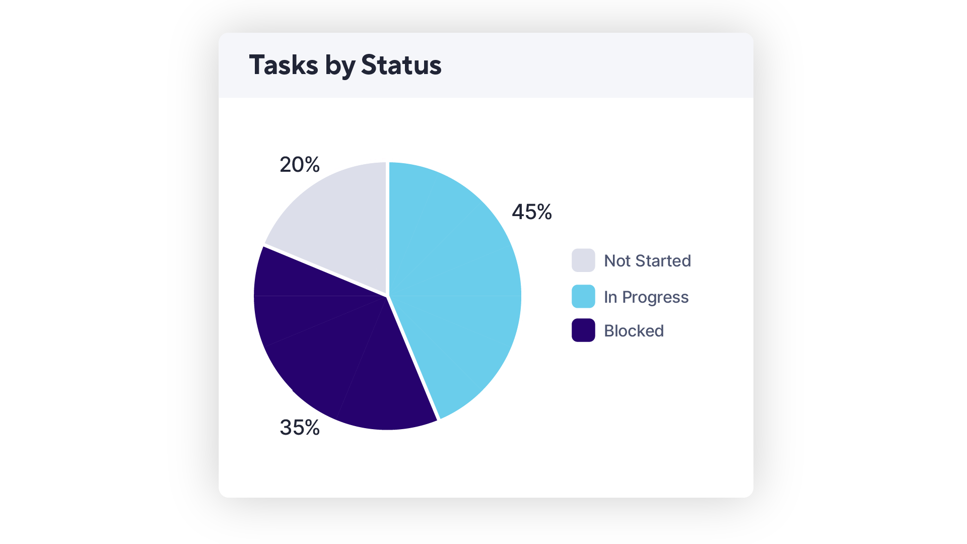
Pro Tip: To remove a specific workflow status from your chart while viewing it in your dashboard, click it on the chart legend and the pie will automatically redistribute. Simply click on it again to add it back.
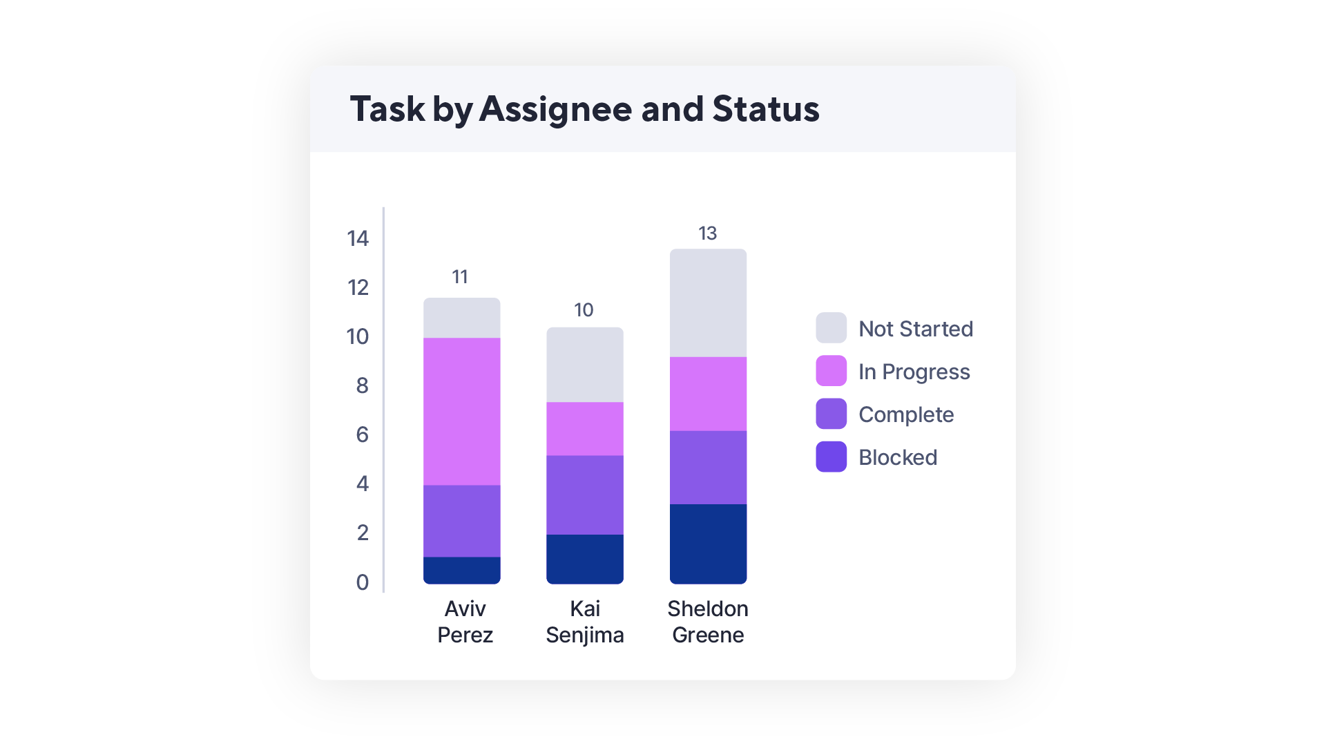
2. Tickets by assignee and status
The Scenario
You want to keep an eye on how many tickets each team member owns to help evenly balance workloads and identify potential over- or under-performers.
The Prompt
How many tickets are assigned to each person on my team? Show as a stacked column chart with ticket status.
The Chart
3. Total sales by customer
The Scenario
Your company hosts a quarterly customer appreciation dinner. You want to make sure you not only invite but also regularly maintain relationships with your biggest champions (and spenders).
The Prompt
Show me our Q3 sales revenue by customer.
The Chart
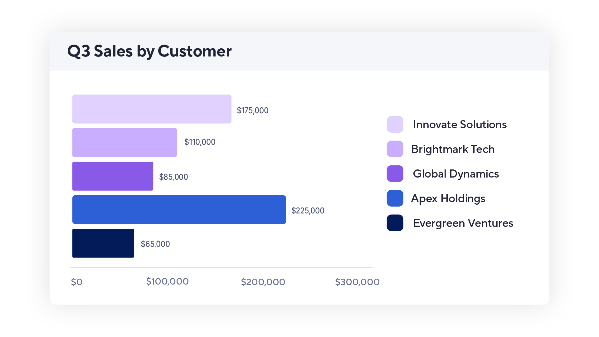
Pro Tip: Using analyze data, you can generate column, stacked column, line, and pie charts instantly. Add the chart to a dashboard to switch to any other chart type you’d prefer—choose from bar, stacked bar, donut, and more!
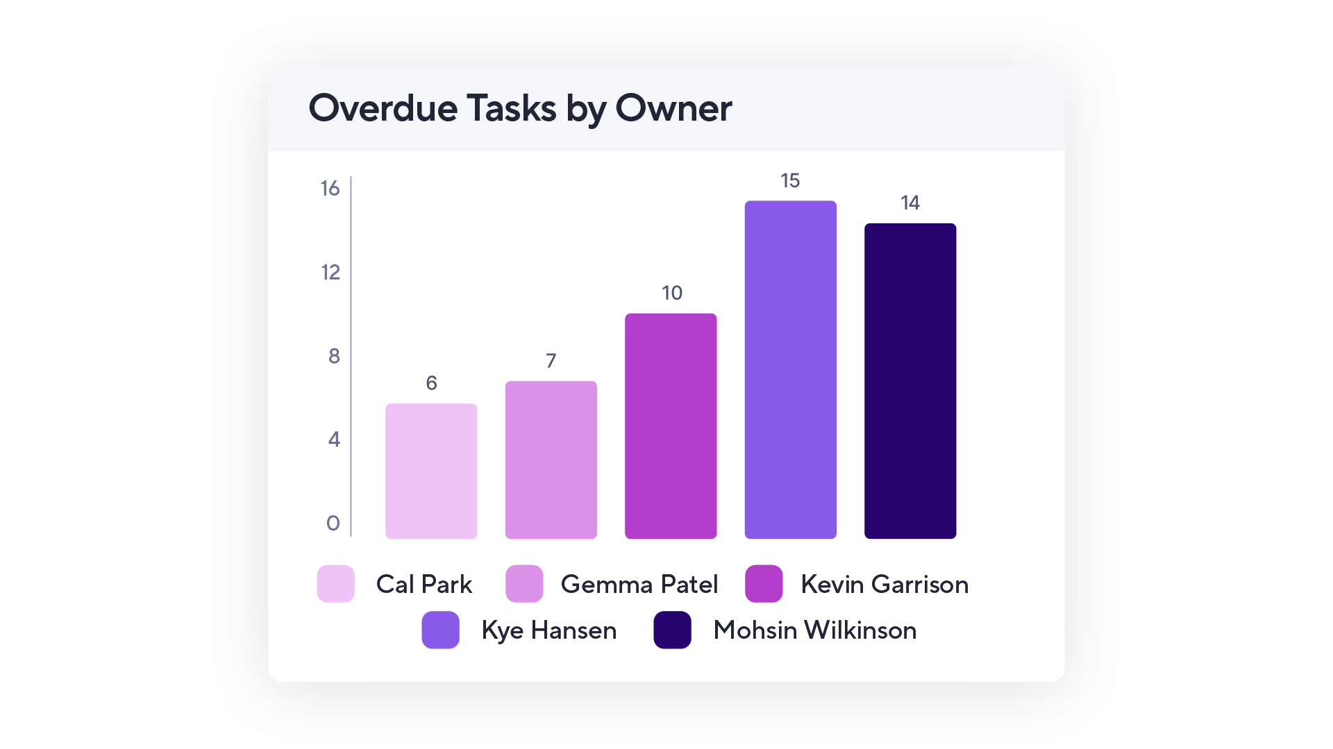
4. Overdue tasks by owner
The Scenario
Keeping team members accountable and proactively addressing roadblocks before they become real risks requires you to keep an eye on any overdue tasks and who owns them.
The Prompt
I want to see how many tasks are overdue and who is assigned to them.
The Chart
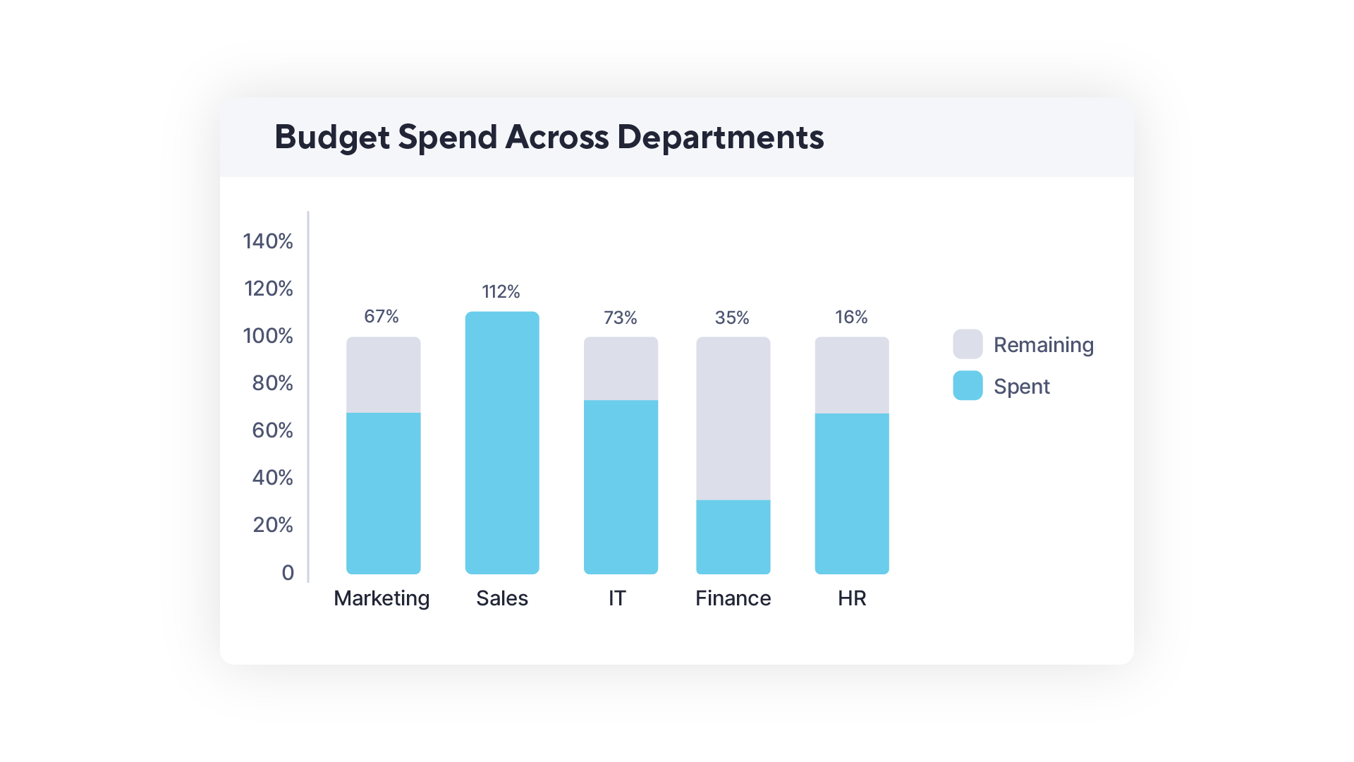
5. Budget spend across departments
The Scenario
Having a constant bird’s eye view of spending across marketing, IT, sales, and other departments helps you keep budgets in check and everyone pacing according to plan.
The Prompt
What percent of their total annual budget has each department spent so far?
The Chart
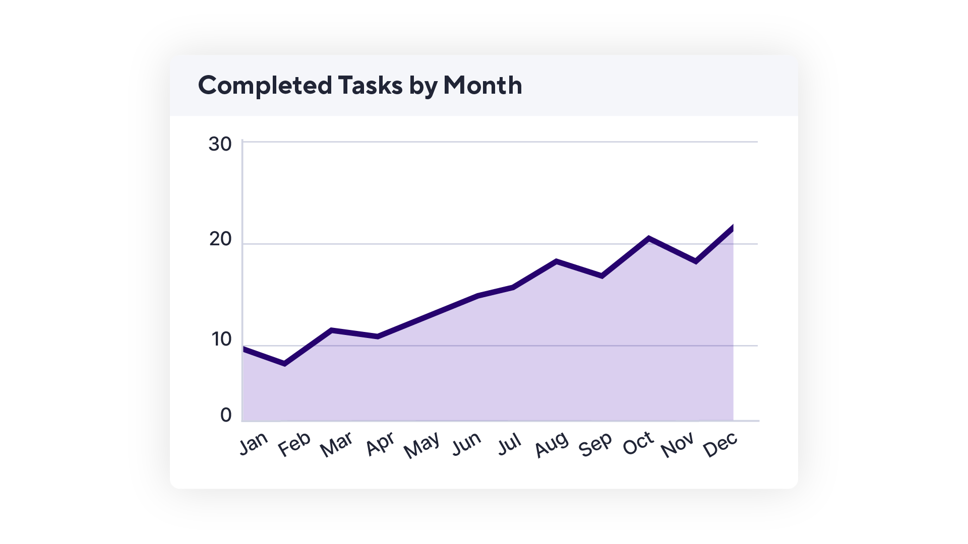
6. Completed tasks by month
The Scenario
Your manager wants to see a steady increase in team productivity before they’re willing to approve the additional headcount you requested.
The Prompt
Make a line graph showing how many tasks are marked as complete each month this year.
The Chart
Start telling stories with your data
Not a data analyst? No problem. From reviewing task statuses to spotting potential project roadblocks, the analyze data AI tool in Smartsheet makes it fast and easy for everyone to discover, share, and monitor real-time insights.
As one of our customers says, “I love just typing in what I am looking for and automatically getting the insight I need from my data. This will help me give my supervisor a quick figure without having to create a formula for it.”
Analyze data is available to all Smartsheet trial users and Enterprise Plan customers. Curious to try this new feature? Upgrade your Smartsheet account or sign up for a free trial.