What Are Executive Dashboards?
In a world awash in data —there are 2.5 quintillion bytes of data generated every day according to IBM—it’s important to have a way to filter the information that is most vital to you and your organization so it can be easily and quickly accessed to support highly informed decision making.
With an executive dashboard, you can make sense of massive amounts of data and make fact-based decisions in real time. Executive dashboards, also known as strategic dashboards, are a graphical interface using real-time data. This information allows managers to get a big picture view of the organization against critical metrics, identify opportunities for expansion, and see where improvements are needed. Dashboards consolidate and arrange numbers, Key Performance Indicators (KPIs), and sometimes performance scorecards on a single screen, tailored for C-level executives and managers. The customizable interface should have the ability to pull real-time data from multiple sources like accounting software, customer relationship management (CRM) system, your email system, or a website analytics program.
There are three criteria to help you establish the KPIs to include on your dashboard. First, they should relate directly to your organization's goals. Second, they should be quantitative and quantifiable. Most importantly, KPIs should be linked directly to the measurement of the organization's success. For more on setting your own KPIs to inform dashboards, check out our comprehensive post, “All About KPI Dashboards.”
Using dashboards continues to grow as a way for businesses to make effective strategic and tactical decisions in the face of ever-increasing global competitive pressures. And there is evidence that using highly visual dashboards do make a difference: in a 2013 study, the Aberdeen Group found that managers who used visualized analytics are almost 30% more likely to find information to support their decisions on time, compared to managers in organizations that only have managed reporting and/or dashboards.
Must-Have Dashboard Features
What are the essential business intelligence highlights and signals leaders need to make the most of dashboards? Here are the features to look for:
Visual Features
- Customization: You should be able to access data you want and view it in a way that makes sense to you. Individual users should be able to customize what they’re viewing, too.
- Drag-and-Drop Interface: You can pick the dashboard elements that you want to see and place them where you want on the page with a drag-and-drop interface. This method is also the way to add dashboard widgets to bring in more data. It’s a straightforward and easy way to meet your particular needs..
- Color and Font Selection: Make dashboards even more visually appealing with the ability to choose the color and fonts. This flexibility is great for companies that want to use some of the data as a sales tool and would like the color scheme and style to match their brand.
- Dashboard Component Graphics: There are many options available to show data beyond the typical chart or gauge graphic. Some graphic options are speedometers, area and line charts, dot plots, pivots, and interactive graphs.
Infrastructure and Platform Features
- Cloud-Based: A cloud-based dashboard can be easier to deploy and maintain, and it’s accessible on multiple devices anytime, anywhere. When you’re analyzing websites and online marketing programs, a lot of the data may already reside in the cloud. Check if there are any storage limitations with these cloud-based dashboards.
- Platform Support: If you’re not getting web-based dashboard software, then you’ll want to make sure that it works with the computers you currently use, whether it’s Windows, Unix, or Mac.
- Mobile Options: Many dashboard software options have mobile counterparts that let you view the data on tablets or smartphones. If this is important, make sure the data you want to view is available in the mobile format. If there isn’t a mobile app, you still may be able to access dashboards if it’s a web-based solution.
Data Features
- Data Blending: This process extracts information from multiple data sources and narrows it down to display only the data that is useful. Data blending is helpful to find correlations between different data sets.
- Data Drill Down: Dashboards present a view of data that is a point-in-time snapshot. You can learn more about any element on the dashboard by clicking on it. The information that appears after clicking is the data drill down. This action takes you from a summary overview to a more detailed view of the data. Some dashboard software limit the number of drill downs you can perform.
- Access to Your Databases, including Excel: Whether you’re using a proprietary or purchased database (such as SQL, Oracle, SAP, etc.) to store your company data, the dashboard software you select should be able to plug into it and access the data. With this in mind, create a list of where you want to get the data that will populate your dashboard and make sure the solution you select is compatible with those databases. Small and midsize businesses (SMB) often keep a lot of their data in Microsoft Office tools such as Excel. It’s important that the dashboard can not only access and analyze data from Excel, but it should also to export data as well to Excel or a PDF.
- Access to Multiple Data Sources: Data can come from just about anywhere; not only from your company. You may want to incorporate data from Google Analytics, Twitter, and other social media platforms in a single dashboard. If that’s the case, make sure the dashboard software you select will let you incorporate these types of data sources.
User Features
- Multiple Users: Depending on the type of dashboard software you select, there could be a limit to how many users can access it. Additionally, there could be limitations on how many people can view a dashboard simultaneously. Be sure to ask if there is a cost to add more users. This will be important to know when evaluating deployment and maintenance costs.
- Dashboard Sharing Control: This depends on you and how much of your data you want to expose. Private dashboards let only a few people access your company’s dashboard. The key feature here is control and having the ability to either share your dashboard with everyone or just a few people, and how you want to accomplish it.
- Collaboration Tools: Like other management and project tools, collaboration options can be beneficial. In addition to being able to leave comments, create slideshows and share key business metrics, dashboard software should also have automation features, like the ability to schedule reports and program notifications.
Benefits of Executive Dashboards
The chief benefit of executive dashboards is that they provide a vehicle for ongoing improvement throughout your organization. Because you are measuring performance, you can improve it, or as Doug Conant, former CEO of Campbell’s Soup says, “To win in the marketplace you must first win in the workplace.” Executive dashboards benefit organizations by making it easier to:
- Assess performance against plans to take meaningful action. With the ability to monitor performance everywhere in your organization, you can measure and make improvements. For example, if you scan multiple data sets, you can make correlations between operating conditions and business performance, or identify trends and make course corrections before problems arise.
- Improve internal communications. Dashboards are a great communication tool because it’s easy to see how the company and departments are performing. Telling your company’s story through data visualization makes it easy to create powerful presentation material for meetings on a large or small scale.
- Improve external communications. Dashboards can speed communication and connectivity with suppliers and customers. And if your organization is looking for funding or reporting to board members and investors, dashboards make it easy to create and share compelling reports and presentations.
- Save time. A well-configured dashboard saves time because all the information you need is in one place. There is less duplication of effort in terms of data entry and manipulation, report creation, and effective communication between departments. Every report generated by your organization should go into your dashboard, and from there it can be easily programmed to automatically update, and shared based on your own criteria.
- Boost employee performance. Consistently and accurately evaluating employee performance is essential not only to individual success, but to the overall success of an organization. A study by SHRM Research showed that “the effective use of key performance indicators (KPIs) that measure human capital outcomes, such as talent management, employee engagement and high performance, illustrates the firm’s business, financial and strategic goals, promotes partnership with senior management for organizational success and demonstrates HR value to the C-suite.”
- Increase profitability. Once you know where you need to make improvements, you know where to focus your time, energy, and resources to improve results and your bottom line.
Types of Executive Dashboards
All executive dashboards provide a high-level view, but it’s also important to be able to take a deep-dive to understand data and how to make corrections to improve results. So, what do dashboards look like? And how do they work in specific use cases?
CIO Dashboard
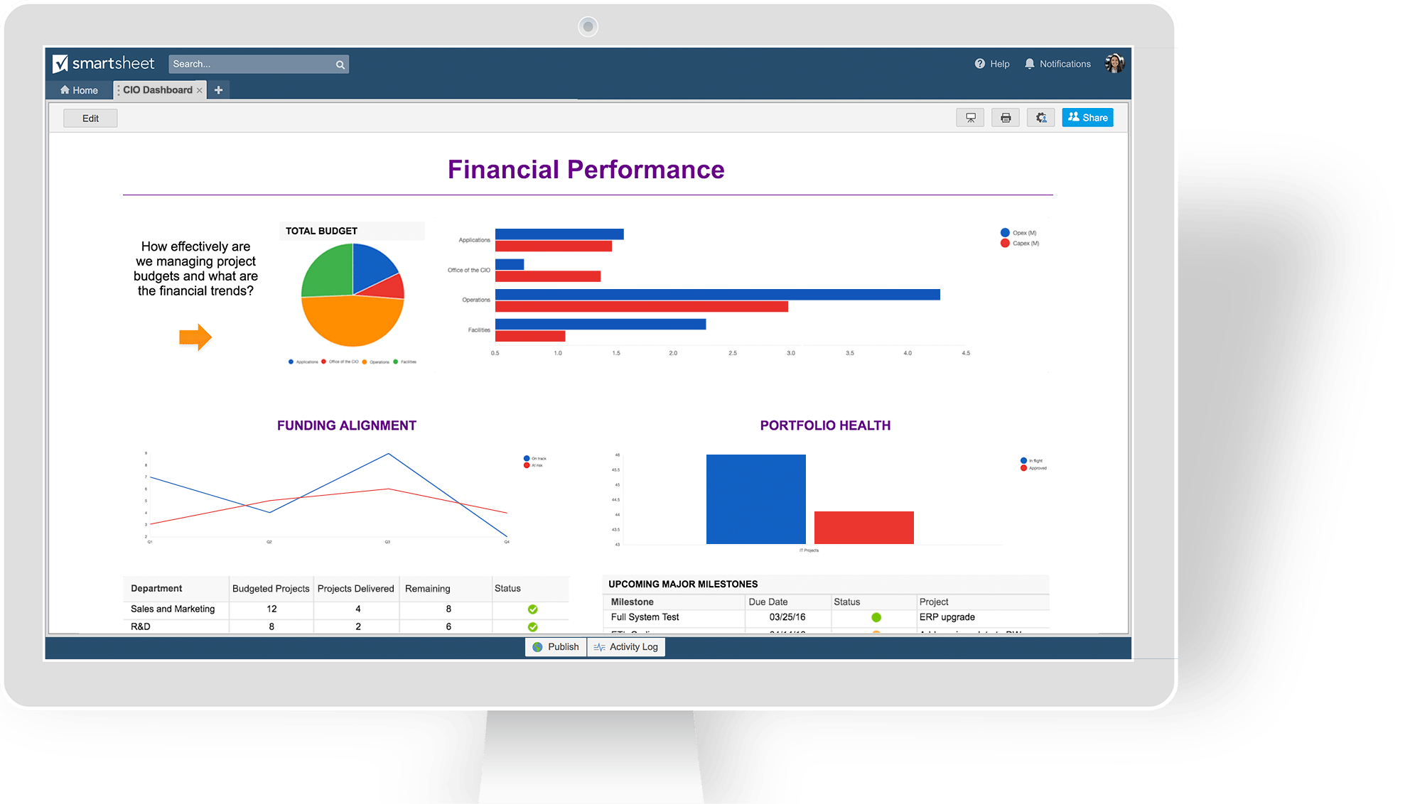
Information technology executives can get an accurate, consistently up-to-date overview of their entire IT portfolio at a glance. You can see if the current portfolio spend is aligning with strategic objectives,where the money is being spent, and get a true check on the health of the portfolio and see upcoming major milestones.
Finance Dashboard
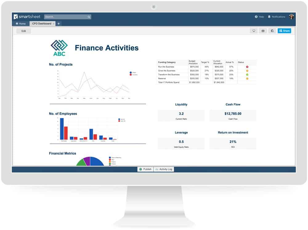
CFOs and other executives who need quick big picture financial summaries can get them via a dashboard. In a glance, you can see if you’ve reached targets, where you need to check on negative trending, and easily link to more granular information around individual team member status and performance. On one page, you can access the fiscal performance data you need to understand how you can grow profitability—or proactively address issues—that affect your bottom line.
Human Resources Dashboard
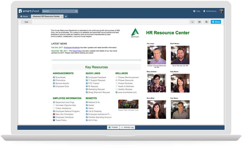
Track all HR activities, projects, and timelines—in real time—from a centralized hub. With one view of all HR activities, you can check hiring status, onboarding procedures, employee programs and how much your department is spending. News feeds give you easy access to the latest information with quick links.
Operations Management Dashboard
Managers at every level can stay on top of operations to track if you’re on schedule, if staff is on track to complete tasks, if you’re on budget, and more. You can provide access to important documents, make sure the team knows about upcoming events and dig into details to see where process improvement can be made.
Project Management Dashboard
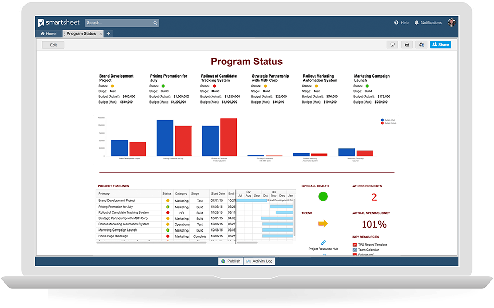
Program and project managers can stay on top of individual or a combination of programs, or dig into the details of an individual project on an as-needed basis. This type of dashboard gives you visibility into all projects in the program and track how they’re performing; an at at-a-glance view of program-level performance metrics, access program documents and various workspaces, and allow a deep dive into detail with just a few clicks.
Sales & Marketing Dashboard
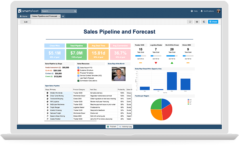
Sales and Marketing executives have high-level or detailed visibility into the sales activities and progress they need to track sales pipeline activity, key metrics, and status. They can also analyze metrics in a number of ways: by pipeline stage, product line, or sales rep to look for any potential weaknesses or strengths. To set up for future success, one click opens up every opportunity in the pipeline.
Selecting the Right Dashboard for Your Needs
As organizations drive to be ever-more nimble, executive dashboards are used by many different kinds of managers. This trend reflects the realization that faster decision-making speeds success by empowering managers to make their own decisions in response to opportunities.
While there are three overall dashboard styles: strategic, analytical, and operational, executive dashboards are strategic by definition. Many executives choose to use a hybrid of two or three so high-level information can be explored via drill-down, to pinpoint ways to improve performance and transform numbers into action.
- Strategic (executive) dashboards show birds-eye-view visualization based on KPIs. They are linked with balanced scorecard strategic planning and management systems methodology that aligns business activities to the vision and strategy of the organization, improve internal and external communications, and monitor organization performance against strategic goals.
- Analytical dashboards offer drill-down functionality to explore data in a granular way and should be accessible to executives and managers. Analytical dashboards can be more complex than strategic or operational dashboards because they focus on gaining insights from a large volume of data collected over time. This data is used to understand what happened, why, and what changes should be made in the future. This kind of business intelligence can used by executives and teams to support decision making.
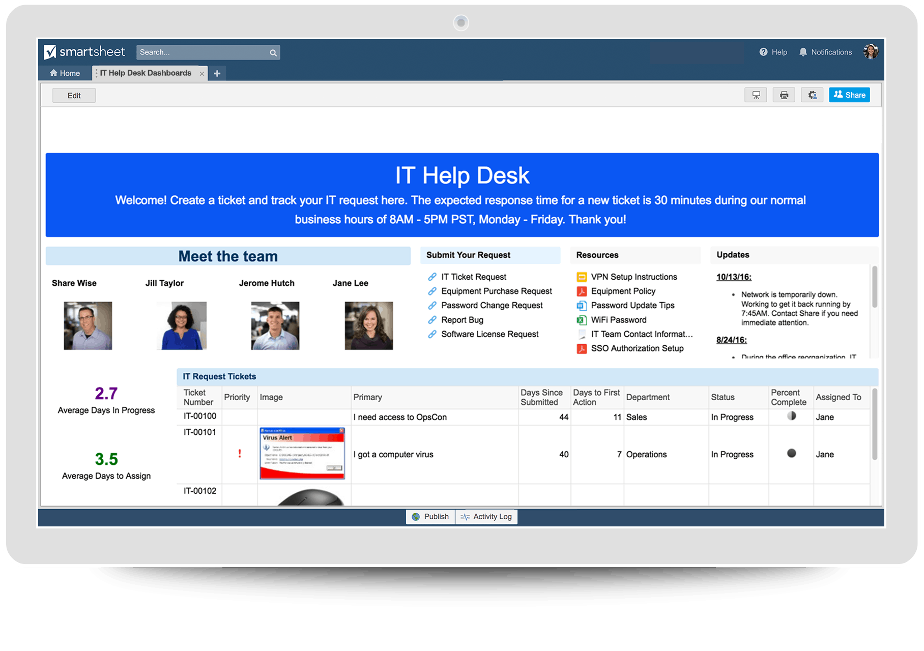
- Operational dashboards display real-time data to help manage daily business processes, and are commonly used by department managers and front-line employees who need to know and act on opportunities and issues ASAP. For example, sales departments may track the number of units sold daily, help desks may use them to understand the types of queries to help better design user information and products, and marketing to see the results of current campaigns.
Once you’ve determined the depth of information you need to access, and which team members will have access or own their own dashboard, what is the right framework to begin development?
Top Three Executive Dashboard Development Best Practices
Executive dashboards require up-front planning and thoughtful design, but the bottom-line results are worthwhile. Best-of-breed dashboards are built with three ideas in mind:
- Make it usable. Best practices for dashboards should follow those for any web page, meaning minimum visual clutter and clear navigation. The main goal is to gain clear, concise, goal-based information, so the more simply the information is presented, the better. There should be zero learning curve for the user. Users should be able to perform basic analytical tasks by using automated software features. When you’re building, keep mobile in mind. So much work is done on the go, so the design should easily translate to the small screen.
- Make it meaningful. This goes back to using KPIs as the supporting framework for your dashboard. Take the time to understand which are the most important data—no more than five key metrics is a best practice—that make your organization successful. Your top level information should be arranged so KPIs are easy to see, and drill-down information easy to access. The data underlying the dashboard should be current so you can be highly effective and competitive.
- Make it easy to take strategic action. Take your dashboard to the next level by organizing the information derived from KPIs into three sections: Insights, Next Steps, and Potential Impacts. Insights means translating what the data means into words: why is a graph moving up or down? Next Steps detail what possible actions can be taken in light of these metrics. Potential Impacts or expected outcomes based on the recommended next steps. Clearly, this approach takes more work, but the analysis and forecasting mean that you are are operating from a strategic rather than a tactical basis.
Make Better Decisions, Faster with Smartsheet Dashboards
Empower your people to go above and beyond with a flexible platform designed to match the needs of your team — and adapt as those needs change.
The Smartsheet platform makes it easy to plan, capture, manage, and report on work from anywhere, helping your team be more effective and get more done. Report on key metrics and get real-time visibility into work as it happens with roll-up reports, dashboards, and automated workflows built to keep your team connected and informed.
When teams have clarity into the work getting done, there’s no telling how much more they can accomplish in the same amount of time. Try Smartsheet for free, today.
